LanguageBlend
Sections
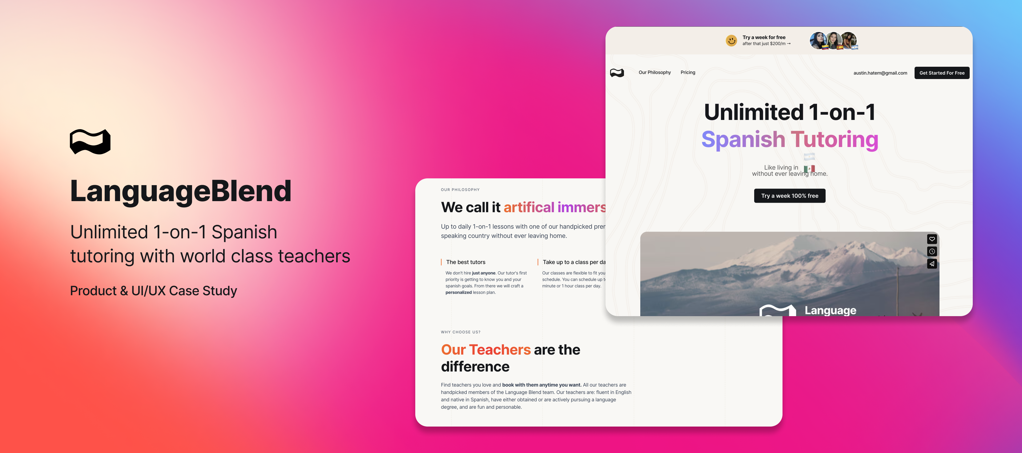
What is Language Blend?
The post Covid world has fueled a new age of digital nomads, there are now three times more remote jobs compared to 2020.
These are not your old school nomads wondering the streets of Bangkok begging for money, these are tech bro’s with $100k+ USD salaries who moved to Mexico City and have no idea what to do with all the extra money now that their rent only costs $18k pesos.
This new wave of nomad likely speaks little to no Spanish, they hated classes in high school. They don’t care about conjugation tables or memorizing irregular verbs they care about actually becoming conversationally fluent.
Language Blend (LB) is no Duolingo killer and will likely never be a one billion dollar unicorn, but what it does have is a very specific emerging market that it plans to capitalize on.
Product

Navigating through many failures, and celebrating a few key successes, has allowed me to develop a framework for product creation.
First off, Our goal was to build a product for the core users who engage with it the most. Building a product for everyone is building a product for no one. If you make sure your most engaged users are having a great experience then you’ll be able to increase engagement which will increase retention which will increase growth.
Next, I wanted to expose customers to our products “Magical Moment” as early and frequently as possible, this will reinforce the value prop and drive customers to return. For LB the “Magical Moment” is getting in that first class with one of the amazing tutors and feeling like learning Spanish might really be possible. Therefore, the UI & UX should prioritize facilitating this “moment” often, minimizing any friction to achieving it.
Lastly, the growth and innovation of a product should be led by data, not intuition. Once you’re able to effectively measure user behavior, retention, and engagement, it becomes essential to pivot to a more scientific, data-led approach in product development.
Data Driven Product Development
The success of a company is increasingly dependent on how effectively it’s able to understand and subsequently act upon it’s data.
Building a data-informed product is the only way a smaller company can have a chance at competing with teams of hundreds of developers. LB has billion dollar competitors and has to build deliberately to have a chance in such a competitive market.
Metrics and finding the “aha moment”
For emerging companies, identifying a clear “top-line” metric aligned with the company’s vision and mission can unify the entire team around a shared goal. For LB, a premium product (~$200/month) with a human aspect that metric was Retention. with such a high price tag retention was naturally going to be lower than an app costing $9/month, but the hypothesis was that students developing real world relationships with teachers would drive to increase retention.
It was then important to monitor retention, understand what drives changes in it, and obsessively push it in the right direction.
The first step in improving retention was finding LB’s “Aha moment”, popularized by Facebook’s “7 friends in 10 Days”, this is the pivotal point where a user recognizes the value of a product. We knew this would be finding how many classes a new user took before they were likely to retain.
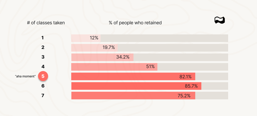
After looking at the numbers it was clear we needed to get users to take 5 classes before they had their “aha moment” and became dedicated customers. This number gives the entire team something to work towards. Now marketing, engineering, and design teams can all have the common goal of getting users to take more classes (ideally at least 5).
Since retention was our “top-line metric” we paid close attention to things like our Triangle Retention Chart. We saw an immense jump in retention from May to June after we converted our calendar to integrate with the Calendly API, we believe this increased class bookings (engagement) and thereby retention.

UI/UX
My goal with every product is to pair a gorgeous inspired design with a data-informed user experience. Once you’ve nailed down why your super users are hooked on your product, you need to tailor the UX so that everyone can see what they are seeing. It’s equally important that the user arrives at the “Magical Moment’ as quickly and with the least amount of friction as possible.
Optimizing signup flow
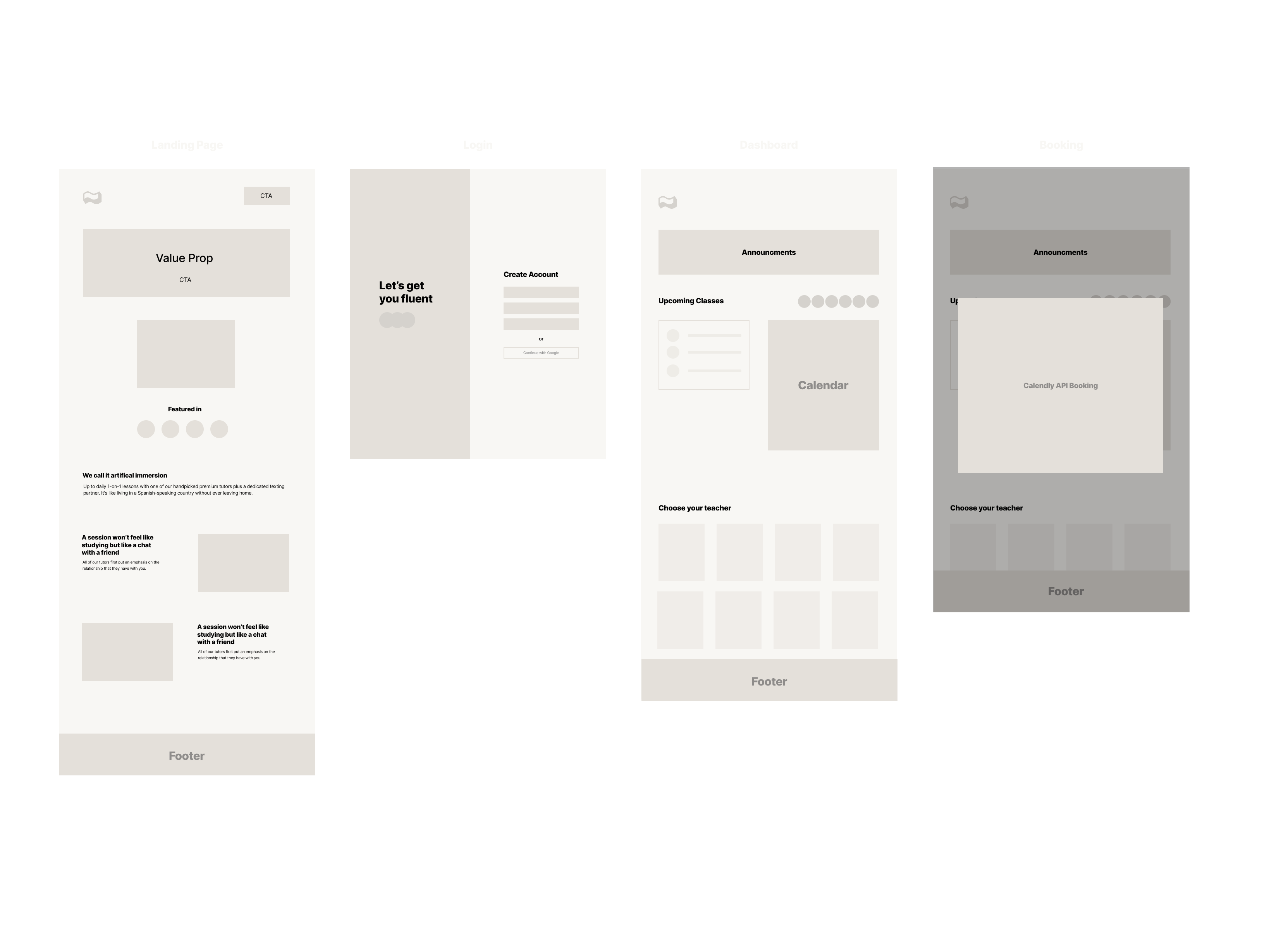
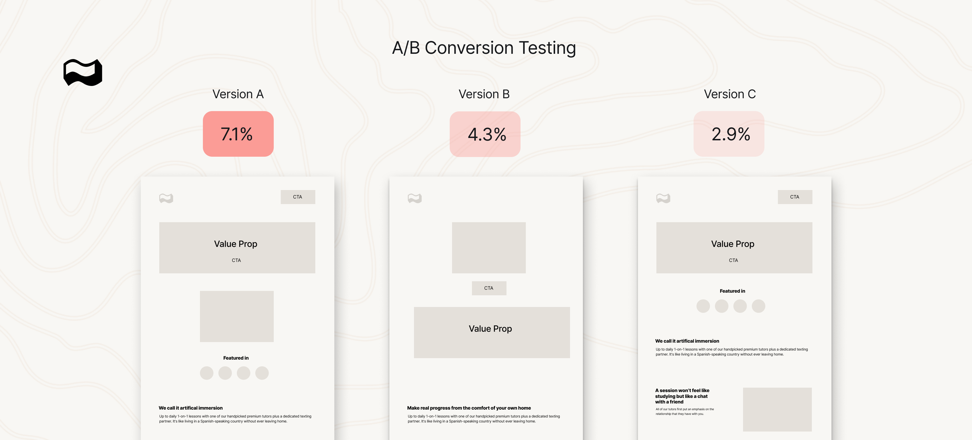
The most effective way to improve retention is to bend the shape of the retention curve as early as possible, this means relentlessly improving your customers onboarding journey. Shortly after LB’s launch we A/B tested 3 user onboarding flows and unsurprisingly found the one that converted the best was the one that asked the least questions.
Additionally, a reoccurring theme we found was that removing visual clutter almost always increased conversions. LB’s onboarding flow is now vastly simpler & more concise than v1 and converts better as a result.
Optimizing bookings
The data was clear that the more classes a user took, the more likely they were to retain. Given this crucial insight, the UI was designed to strategically encourage users to book more classes, effectively driving toward that “aha moment” of 5 classes that significantly improves retention.
Streamlined Booking Process
The booking flow was optimized to require as few clicks as possible, and we added a feature for users to easily repeat past bookings. Moreover, integration with the Calendly API, capitalizing on its status as one of the most widely-used and preferred calendar apps. This integration further streamlined the scheduling process and led to a noticeable increase in class bookings.
Call to Action Placement
The ‘Book a Class’ call-to-action (CTA) button was made highly visible and accessible from multiple points within the app, basically clicking on any teacher picture, date, etc will bring you to the booking page. This minimizes friction and empowers users to quickly commit to more classes.
Reminders and Notifications
Automated reminders via email and in-app notifications were implemented to not only remind users of upcoming classes but also to prompt them to book new ones when their schedule looked sparse.
Conclusion
🤑 15k+MRR (as of Oct 2023)
🧑 100’s of happy customers / users
💻 Created with ReactJs, NextJs, Firebase, Calendly API
In a world where digital nomadism is increasingly becoming the norm, Language Blend has not only recognized an emerging market but has also acted strategically to fulfill its unique needs. Through commitment to user-centric design, data-driven decision-making, and a relentless focus on providing a magical learning experience, my work with LB serves as a noteworthy case study for how to succeed in today’s ever-changing digital landscape.
